CityPup
A design sprint exercise to redesign a website for city residents looking to adopt their own furry friend.

DATE
September 2021
KEY SKILLS
Design Sprint, Experience Mapping, Sketching, Storyboarding, Ideation, Visual Design, Prototyping, Usability Testing
TOOLS
Figma, Marvel, Invision
CONTEXT
-
I conducted a five day Google Ventures Design Sprint focused on quickly Mapping, Sketching, Ideating, Prototyping, and Testing solutions to a Bitesize UX prompt.
-
I selected the CityPups Design Challenge for my Design Sprint prompt. As a proud dog mom myself, I was excited to help other people find their new best friend! The CityPups startup has developed a website which allows users to search the currently adoptable pets in their local organizations and shelters. Through research, the team has found that users living in urban environments struggle to find dogs that are compatible with their unique needs and expectations.
-
Many urban dwellers have unique conditions and requirements that can make finding the perfect dog very difficult. The CityPup app addresses these unique considerations and presents the information in a clear, fun way.

DAY 1: Map
PROBLEM STATEMENT
The CityPups team would like to achieve increased dog adoption rates, happier owners, and better “forever” homes for dogs. It was indicated that this unique user group will require consideration of their individual living spaces, schedules, transportation, access to outdoor spaces, and other city specific criteria. After reviewing the supplemental prompt information and interview, I gathered a few additional insights about the user group for this website:
Users are often seeking an instant connection with the dog through the images and videos shared. This can lead to frustration when the user falls in love with a dog that doesn’t fit their other requirements.
The urban environment can present unique constraints such as a limited distance of travel.
The size and breed of dog may not be enough for users to predict a dog’s personality and temperament. Thorough descriptions and videos may help to address this issue.
A competitive analysis of the other pet adoption websites may help to understand what's currently being offered. Dating websites or mobile apps may also be an interesting reference for successful practices.
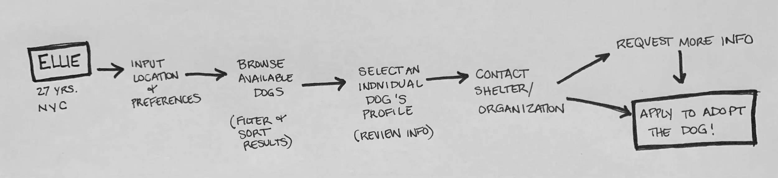
EXPERIENCE MAPPING
I began by sketching out a possible end-to-end experience for my user. I developed a possible path the user would take in order to achieve the end goal of applying to adopt the perfect dog for them.
DAY 2: Sketch
MODIFIED LIGHTNING DEMOS
I reviewed three websites that could be considered competitors, or that serve similar ‘matching’ functions. I was able to pull helpful insights from my review these sites.
Petfinder

Search was simple and easy to use.

The quiz to help you understand your “Best Match” was intriguing, but was more of a nicely formatted preference input/profile creator. It would be helpful to include links to resources explaining what age/breed/size of dog might be best for you.

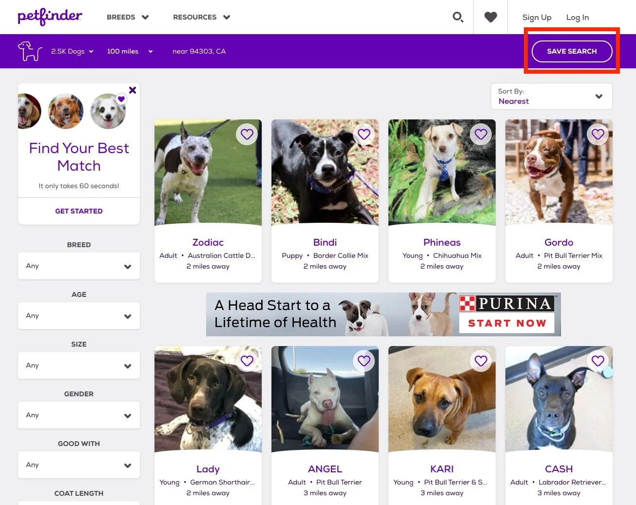
The option to save a search makes it convenient and easy to preserve your preferences. The list of saved dog profiles helps you return to favorites.

Individual dog pages were clear, helpful, and allowed direct communication with the Organization/Shelter.
AdoptaPet

Search options were similar to Petfinder.

Filter Options were clear. Adoption fees seem to only be shared in the description. Maybe the price range could be a category/filter.

New Pet Alert option seemed helpful and allowed for a paid increase in notifications.

When Connecting with Organizations/Shelters, personal information was required. The autofill option with login would be helpful when interested in multiple dogs. Standardized questions/answers could also be used to expedite the application process.
Match

The onboarding was easy and almost fun to click through. It showed compatible profiles as you answered questions, which may motivate user to complete onboarding.

The prompted text entry option could this be used to share user’s additional information and general questions for the Organizations/Shelters.

Offers the option for Premium account. ACityPups upgrade could include a team member that will handpick and recommend dogs for you based on your preferences or previous selections. Almost like a doggy matchmaker!

The “Tell Us About Your Partner in Crime” was a fun format. This could be used in the CityPups webpage to help users quickly create a ‘dream pet’ or ‘perfect pet’ profile so that any browsing/searches already come pre-sorted. Unique searches could still be possible.

Users may prefer to initially select a pet based on appearances, similar to a dating app. There could be a slider to allow for a “Instant Connection” format. Images and videos would be the top priority and info secondary.
CRAZY 8s EXERCISE
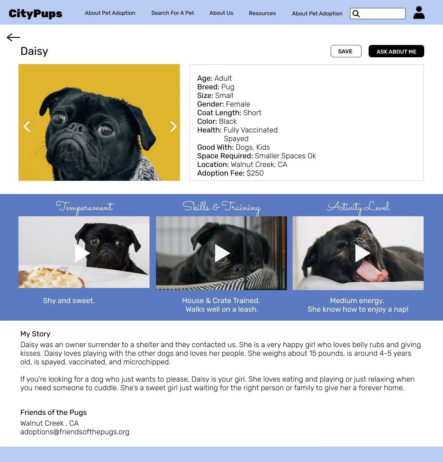
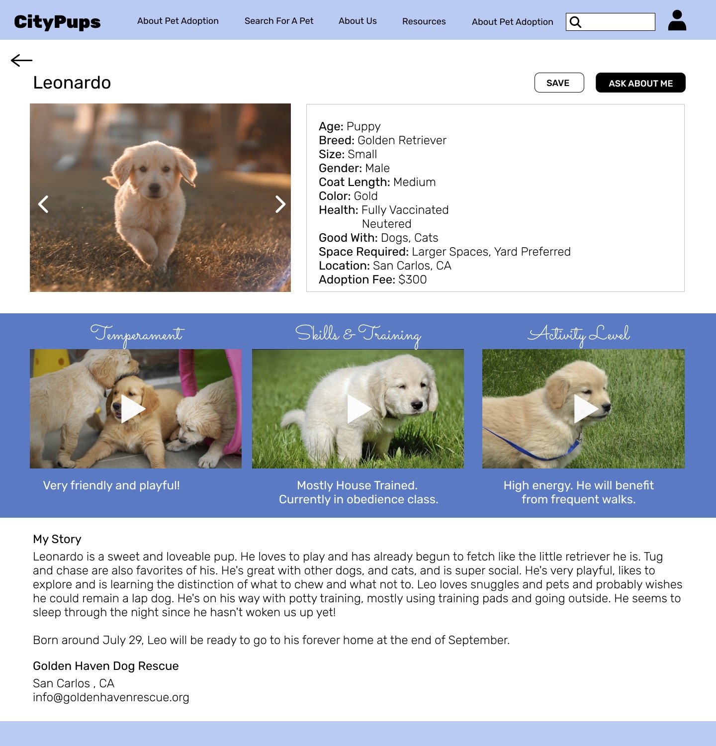
Initially, I considered the Browse screen to be the most important, but I realized that users seemed to be having the most frustration with the lack of information on the Individual Dog Profile screen. This is the most critical screen because it’s typically the screen on which users decide whether the dog they selected is right for them. Insufficient information or images may prevent a user from ever moving onto the final step of applying to adopt the dog.
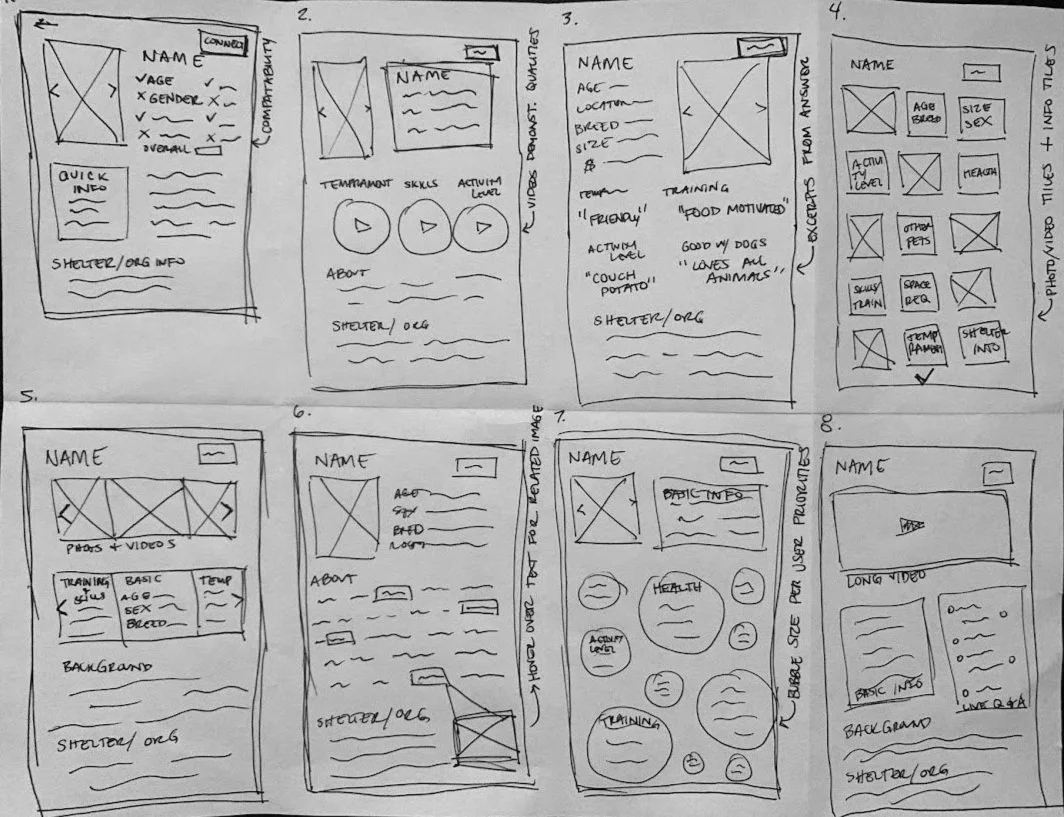
Initial Sketch
Solution Sketch
DAY 3: Decide
REFLECTION
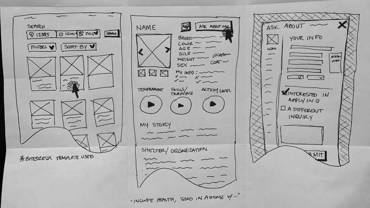
Although I was initially drawn to the multi-tiled option (#4) and the use of a live Q&A feed (option #8), I chose the second sketch because I felt that the use of videos to demonstrate a dog’s attributes could be really helpful in highlighting the most important and unique criteria that urban pet owners may be concerned about. Other important information such as the dog’s tolerance for a smaller living space or busy street could also be highlighted within these short videos. Overall, this solution will hopefully provide more insightful content for the user so that they can feel confident in their decision to apply for and adopt a dog.
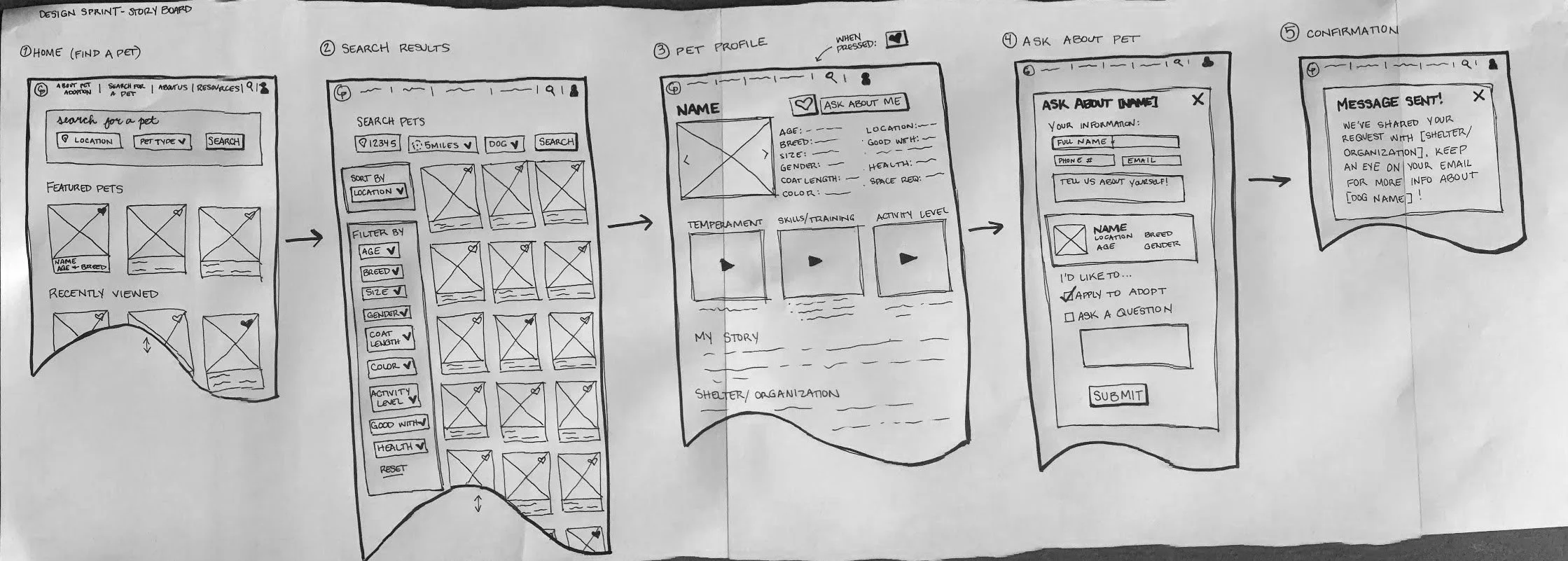
STORYBOARDING
Starting at the home page, the Apply to Adopt a Pet route was pretty straightforward. The Search Results screen is fairly complex, but allows users to customize their search. I created a confirmation screen in order to complete the activity and explain next steps in the process.
DAY 4: Prototype
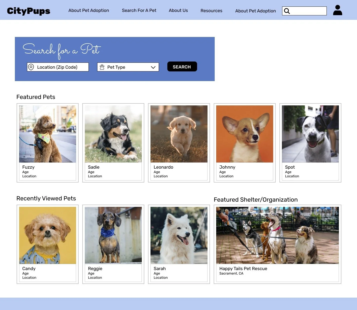
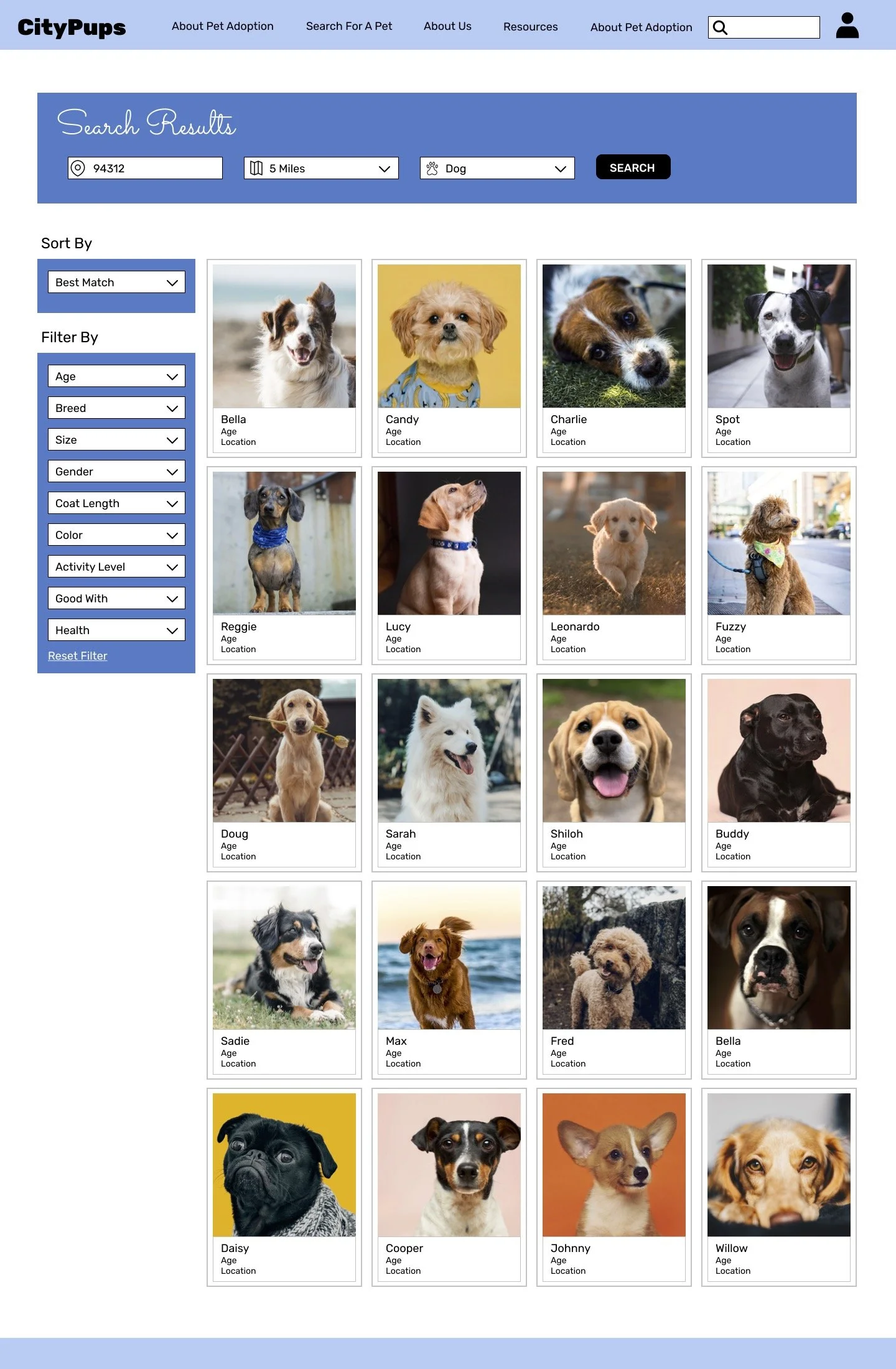
PROTOTYPE SCREENS
I really enjoyed developing this prototype. Although the Home and search Screens may look very similar to their competitors, the individual doggy profile pages bring a unique level of detail and excitement with the videos and in-depth information. Through testing I hope to receive user feedback on the use of the video clips. I also look forward to learning how I can make the website even more catered to the unique needs of the aspiring urban dog owner.


DAY 5: Test
INTERVIEWS
I conducted five video interviews with participants that appeared to fall into the target user group: urban dog owners, or aspiring urban dog owners. As I moved through each interview, I came to notice a few patterns in the feedback I received:
Most of the participants were immediately drawn to the images of the available dogs. The visual appearance or ‘cuteness’ of a dog often had a little more weight than the other criteria.
Participants felt that the videos were very helpful for users who wanted to better understand the personality and needs of the dog they were interested in.
The ‘Good With’ section only lists if a dog is known to interact positively with other animals or children. Participants noted that it would be helpful to also know if the dog didn’t work well with other animals or children. A graphic depiction of this information (check or x) has been used on other sites and may be a more successful way to convey it.
The option to ‘Save’ a dog’s profile also received positive feedback from test participants. One pointed out that it would be helpful to let users know if the dog was receiving a lot of views or saves so they know if they should act quickly if they feel this is the dog they want to adopt.
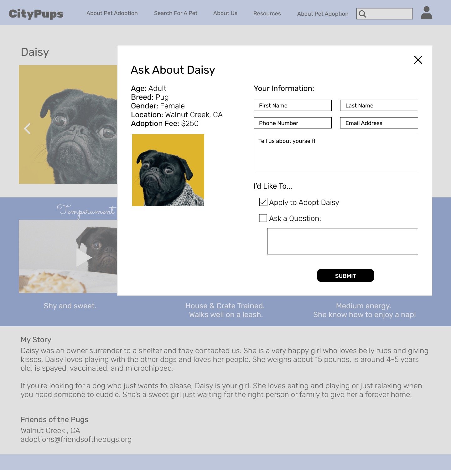
The phrasing for the “Ask About Me” button was confusing for some participants. It may be better to use a phrase like “Get More Info” instead.
It was also noted that some users wanted an easier process to ask simple questions. This reminds me of one of my initial ideas to create a live Q&A section on the profile screen. This would the shelter to only have to answer questions once, and would free up the “Ask About Me” button to be dedicated to applying to adopt the dog.
CONCLUSIONS
Overall, this GV Design Sprint exercise helped me to understand how much can be learned about the current problem, possible solutions, and user feedback in just a week. I felt that I was really able to get some exciting ideas (personality video clips, live Q&A section) from this process that could be a great addition to the app if further tested and developed.