ShareSplitTrade
A mobile app designed to help crafters and creatives be more sustainable and foster a community which encourages the reuse and repurposing of unused crafting materials.

DATE
January-September 2021
KEY SKILLS
Heuristic Evaluation, Interviews, Affinity Mapping, Empathy Mapping, Persona Development, User Stories & Flows, Ideation, Sketching, Information Architecture, Wireframing, Wireflows, Visual Design, Usability Testing
TOOLS
Figma, Miro, Milanote, Marvel, Invision
CONTEXT
-
Crafting and creativity have been a part of my life since an early age. I’ve enjoyed the creative outlet but I’ve experienced frustrations with the excess crafting supplies that would often go to waste. Although material waste is a common and widely acknowledged result of the crafting industry, it’s difficult to quantify.
-
Crafting and DIY projects often result in an abundance of unused materials, which are either discarded or saved for future use. This sense of waste can negatively impact the creative experience for the more than 62.5 million people that craft each year. The ShareSplitTrade app takes advantage of the social connections between crafters to encourage and facilitate more environmentally conscious interactions with materials. One of the biggest challenges was to design an app for such a diverse group of creatives, with a wide range of ages, interests, and locations.
-
I utilized a human-centered design approach as I moved through the product design cycle to develop the SareSplitTrade app. The initial work to empathize with my target user group helped me to better define the problem I sought to address through my ideation, prototyping, testing, and iteration.
-
During this capstone project, I conducted each step of the product design process with the guidance of a UX/UI mentor.

DISCOVERY
SECONDARY RESEARCH
The crafting community includes a very diverse group of users. Despite the variety of backgrounds and interests, there appears to be a common difficulty with material excess and the associated waste.
HEURISTIC EVALUATION
A heuristic evaluation of competitors was also conducted. I sought out apps and websites that addressed crafting waste and excess materials. I reviewed the Pinterest, SnapGuide, and Recyclart apps. All offered craft inspiration images and/or guides with varying levels of material reuse or upcycling, but few crafting apps directly addressed the issue of waste.
PRIMARY RESEARCH
A screener survey was used to recruit candidates that fell into the target user group.
Five video interviews were then conducted, asking questions regarding crafting materials, waste, and the apps or websites typically used. My goal for these interviews was to better understand the impact of crafting waste on users, and their thoughts on sharing of materials and environmentally conscious practices.
KEY RESEARCH INSIGHTS
Crafters want to save money.
Crafters would like to share their excess materials with friends.
Planning the project is one of the hardest, but most rewarding parts of the creative process.
Sometimes the quantity of supplies you need doesn’t match the amount offered (in store or online). This could lead to a lot of excess and potentially wasted material.
AFFINITY MAPPING
Affinity mapping was used to sort and analyze the findings from my interviews.

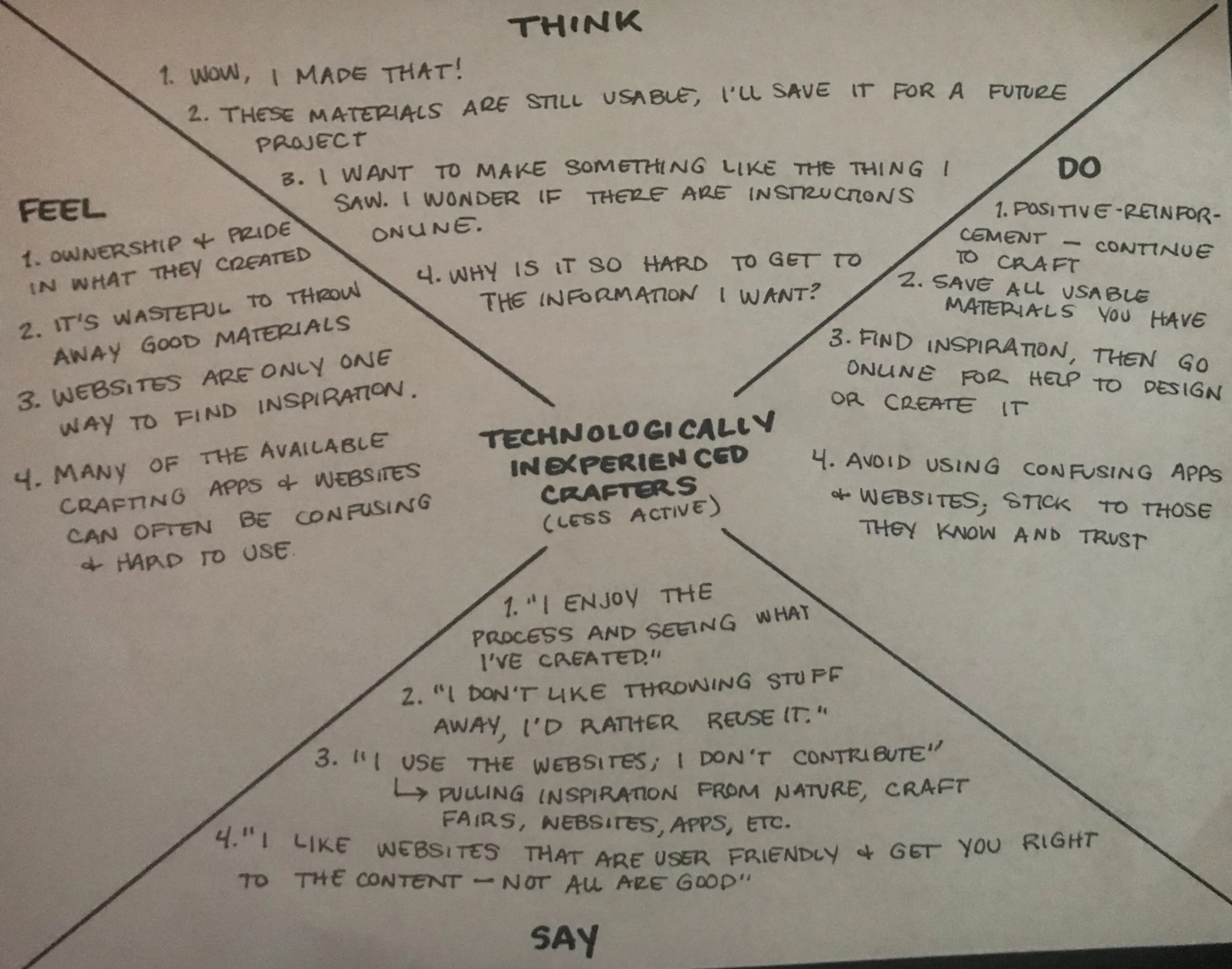
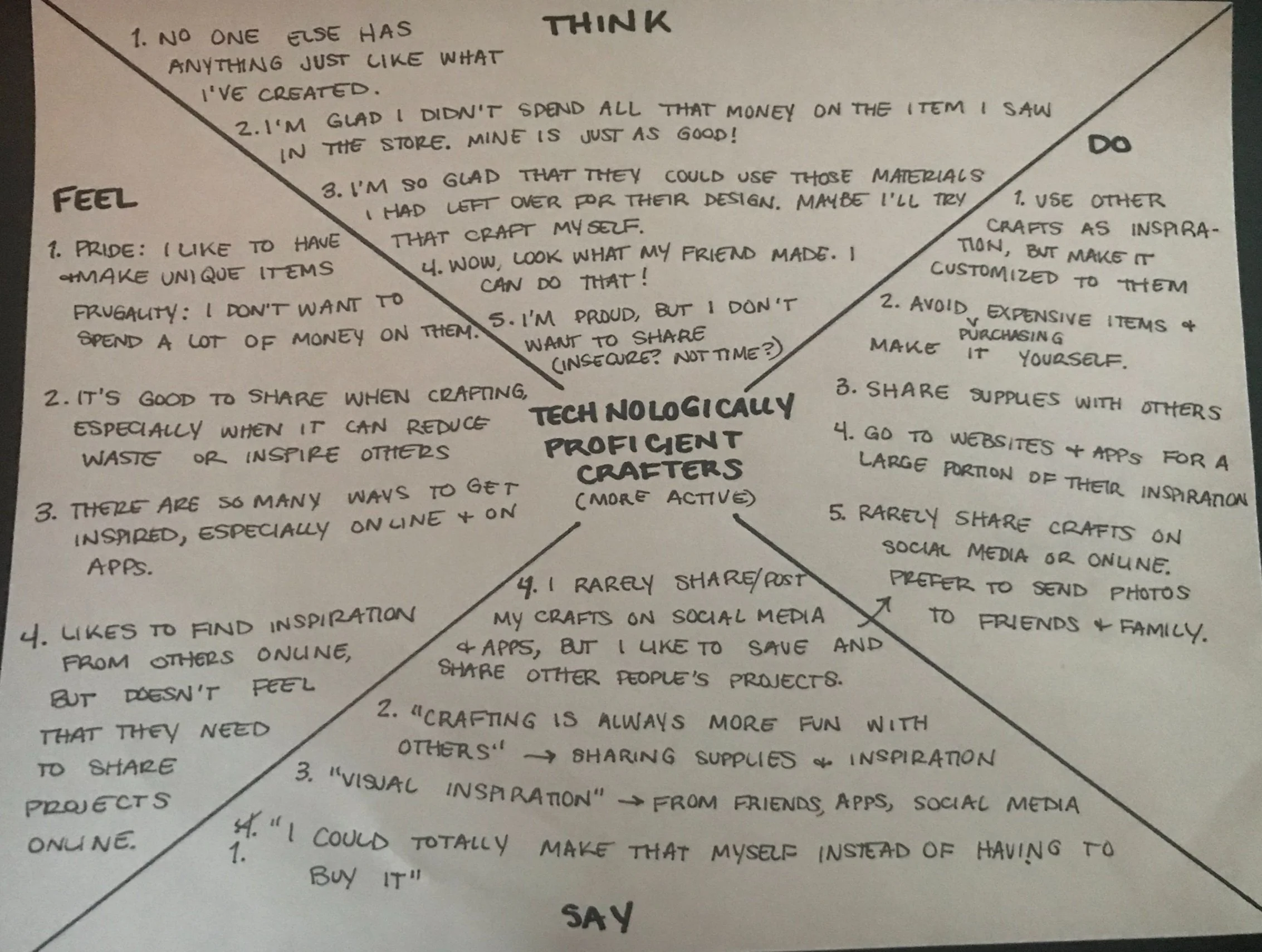
EMPATHY MAPPING
Empathy mapping was used to better understand the thoughts and emotions of users.
USER PERSONAS

Keep-It-Simple Carl
Seeks to create unique crafts within the constraints of his tight schedule and budget. He values technology for the crafting information/knowledge it provides but keeps his social activity mostly in-person
Social Susan
Finds herself limited by her small (and often disorganized) material storage space. Much of her inspiration comes from her interactions with others on social media.
Both personas value the benefits which often come with saving or reusing crafting materials: saving money, avoiding waste, and being more sustainable
EXPERIENCE
ARCHITECTURE
My research resulted in many ideas, including some that diverged from my goal and the primary needs of my users. As I worked to determine the most important ideas and components drawn from my research, I developed a site map to better organize the app’s content.

I struggled to determine which user tasks should be prioritized and planned for the MVP. I spent time reviewing my research and considering the needs of my personas, which helped me come to the conclusion that the trading and inventory functions were vital first components to this app.
USER STORIES

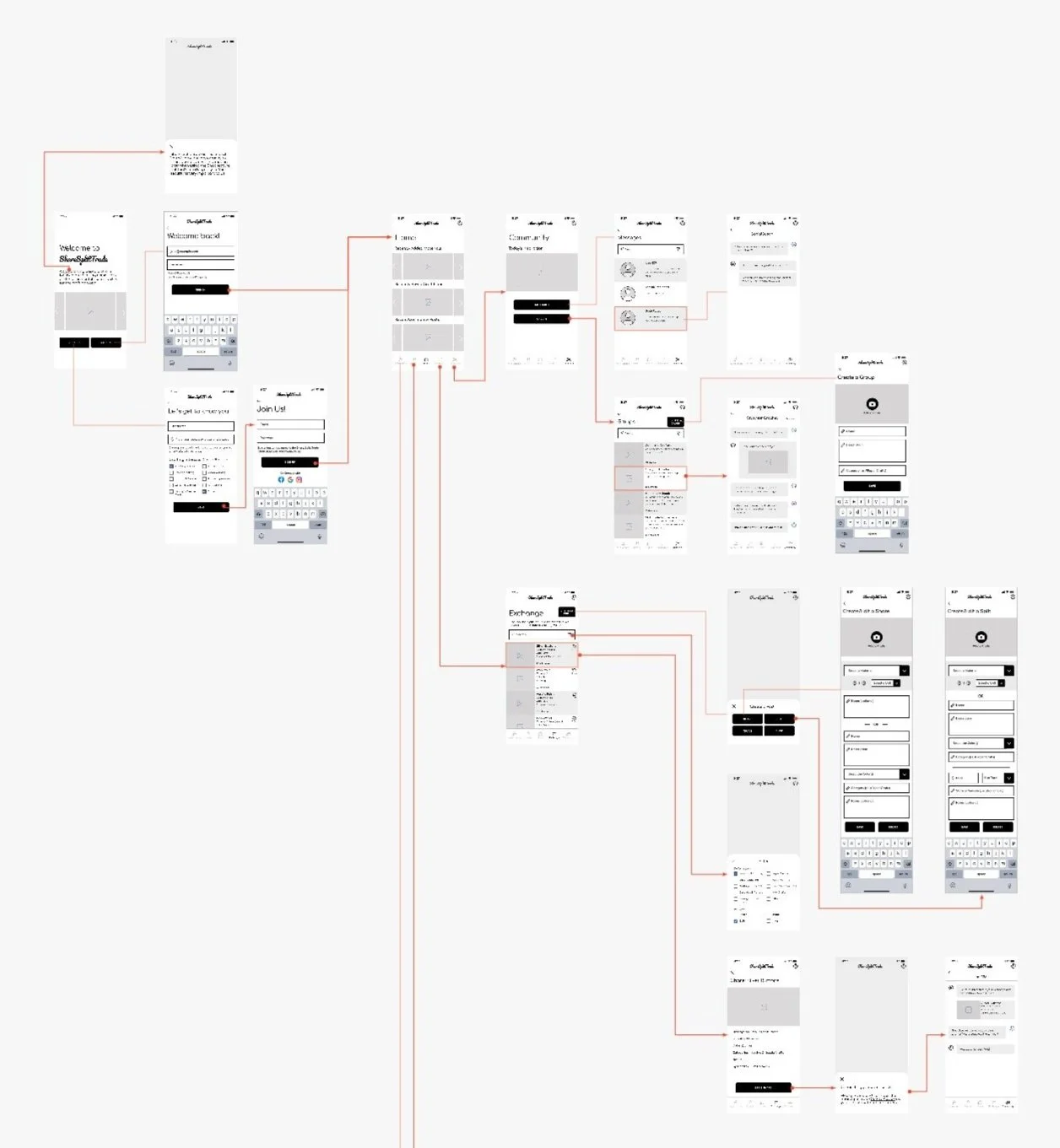
I then identified the most important user activities within the app and created user flows for each red route.
USER FLOWS

SKETCHES
Once I felt confident in my user flows, I worked to develop the app’s visual styles. I used brainstorming and sketching as I began the divergent thinking process.

WIREFRAMING & WIREFLOWS
I iterated using wireframes and wireflows. This helped me to refine the app’s navigation.
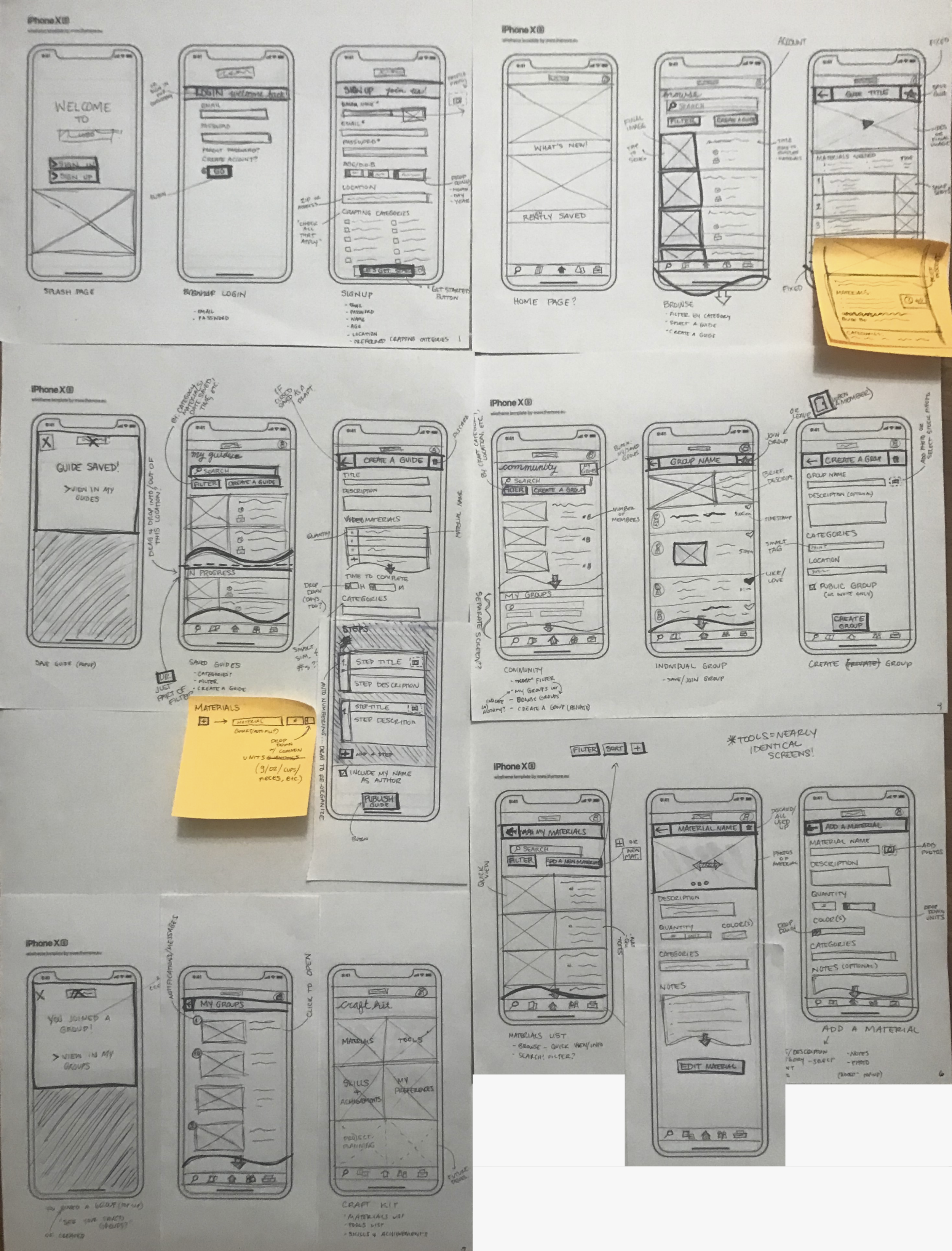
First Iteration

Second Iteration
Low Fidelity Wireframes
Wireflows
INTERFACE
MOODBOARD
This moodboard demonstrates the goal to create a fun, friendly, and welcoming platform. I hoped to portray a sense of community and creativity while also reflecting the sustainable practices inherent in the app’s functions.

STYLE GUIDE
The sentiments within my moodboard were translated into my Style Guide using playful colors and fonts to encourage creativity and inspiration.
Clear body text (sans serif), large buttons, and an overall simple aesthetic were used to make the app more accessible for the diverse user group.

TESTING
GUERILLA USABILITY TESTING
Using my third wireframing iteration, I conducted five 15-20 minute Zoom interviews with people drawn from my previous screener. My interviews focused on testing the two main functions I had developed as well as the basic usability of the app layout and navigation.
I found that inspirational content and interactions with other users were just as important to participants as the inventory and trading functions. This led me to re-evaluate my red routes and revise the screens I then developed within my wireframing.
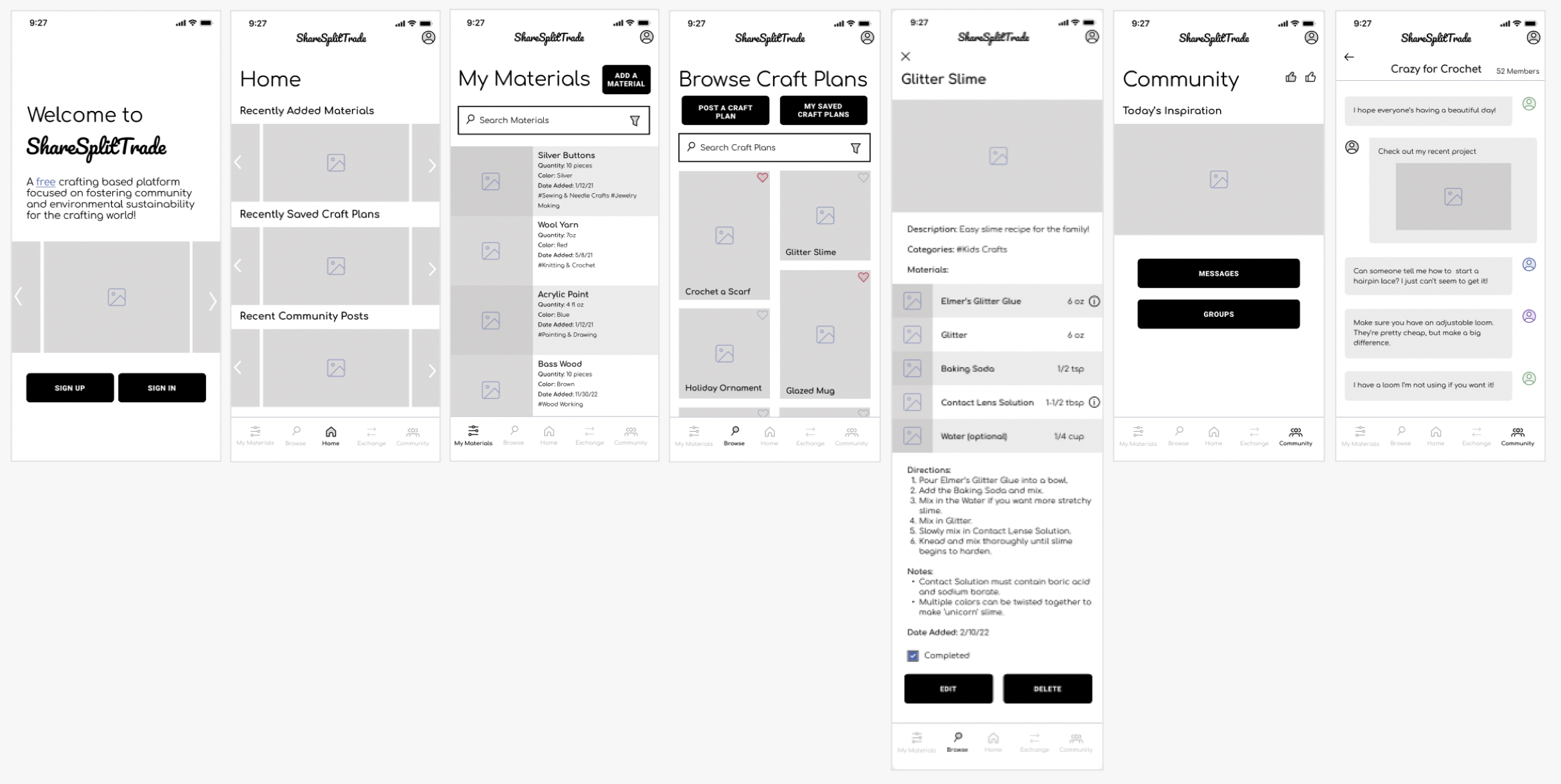
HIGH FIDELITY PROTOTYPE
I then applied the visual styles to my design, and added content to the screens. I created an InVision prototype to use during the following Usability Testing.
USABILITY TESTING
I conducted two rounds of usability testing. The first included one unmoderated and four moderated video interviews. The second round included five moderated interviews.
My findings in my first round of testing informed the revisions I made prior to my second round of testing.
“I didn’t know you could mix sustainability with crafting!”
“Simple but consistent”
“I didn’t look down at [the menu icons] because it looked like those were all inactive or not highlighted. So maybe rather than being screened back, they should be a different color than black.”
SECOND ROUND FINDINGS
Through my usability testing, I was able to improve the visual design and UI of my app. Testing also helped me to understand areas that I should continue to develop and test:
Menu Bar icons are too light and very difficult to read
The Community section and Group Discussion route are currently not intuitive
App elements (buttons and checkboxes) are too small
The function of the ‘Edit’ button within individual Craft Idea summaries is unclear’
The app’s name may be confusing for users
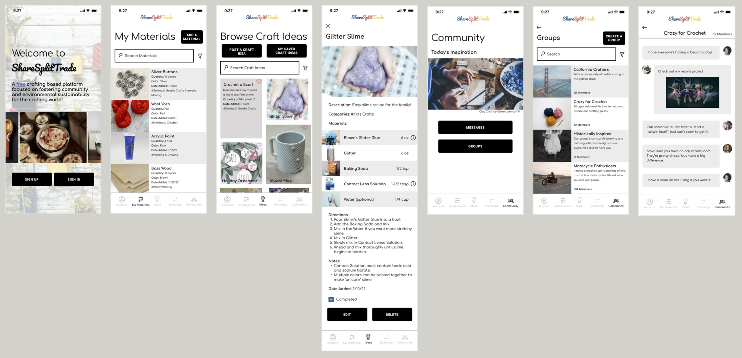
SOLUTION OVERVIEW
MAIN FEATURES

Craft Ideas
Browse craft projects for inspiration. You can save craft ideas you find interesting, or create your own.

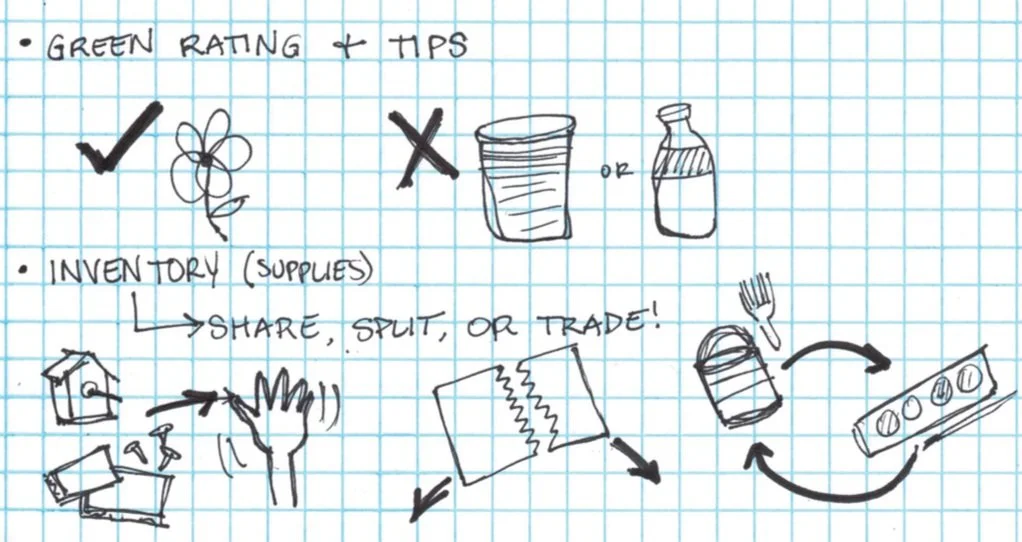
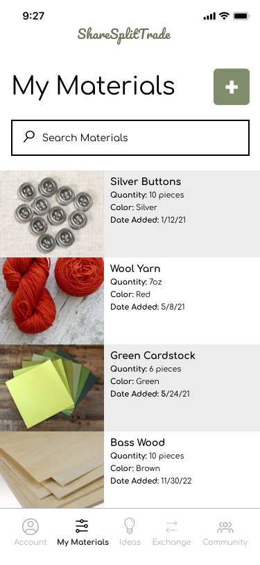
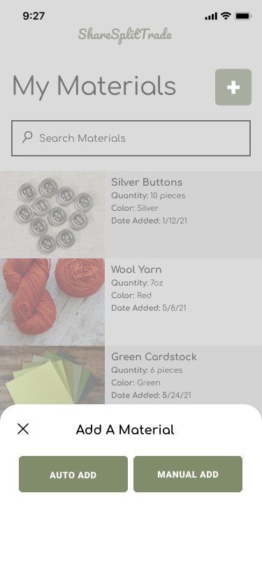
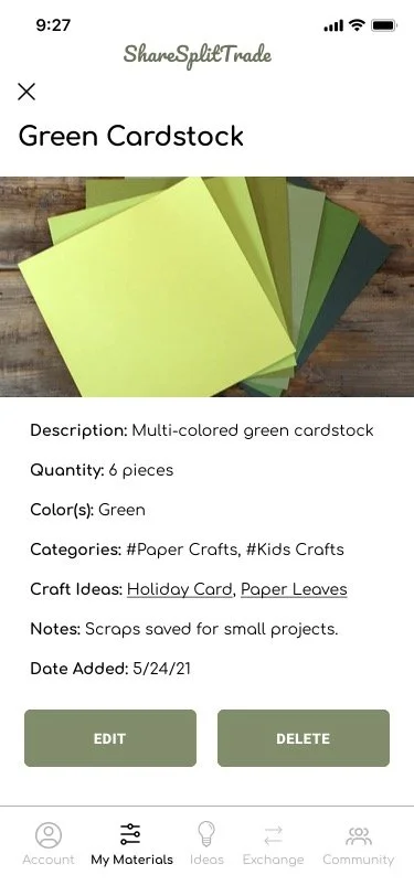
My Materials
Keep an inventory of the crafting materials you have. Select individual materials to see more detailed information.

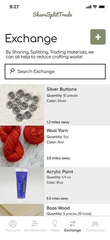
Exchange
Find other crafters that would like to share, split, or trade supplies with you. This can help you save money and reduce waste.

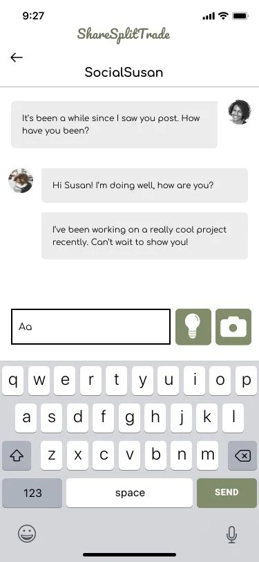
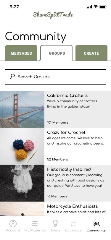
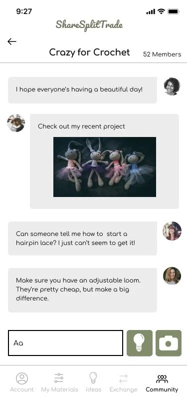
Community
Connect with the crafting community through messaging and group interactions.
Browse the available groups to find people with shared interests or a nearby location. If you don’t find what you’re looking for, you can also create your own group.
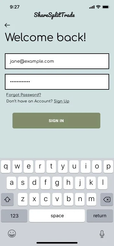
FINAL VISUAL DESIGN


CONCLUSIONS
LESSONS LEARNED
Through my research, design, and testing for the ShareSplitTrade mobile app, I was able to better understand the needs of my target user group. I found that determining the most important functions of the app (which informed my development of the MVP) was the most difficult task because I had my own preconceived notions of what a user valued and expected. Testing helped me challenge these initial ideas and design an app more attuned to the needs of the ‘crafters’ I hoped to serve.
I came to realize that the Craft Idea and Community functions could be used to intrigue and introduce users to the platform before I fully developed the My Materials and Exchange sections. Initially, I had planned to directly address my Problem statement with Sustainable practices through the sharing of facts and tips. Through testing, I found that the activities within the app could foster sustainable practices without directly calling it to the user’s attention. This was an important realization since waste prevention and sustainability are intrinsic to my goals for the app. A combined sense of creativity, community, and sustainability reflect the diverse and complex users I aim to serve.
NEXT STEPS
Based on my last round of Usability testing, I hope to continue iterating upon and testing my design to better develop the Community and Exchange sections of my app.
If possible, I would also like to use this project to better understand the technical side of app development. I believe that this app could be an asset to the crafting world, and would love to share it with others!